

The appearance of the house
Choosing a façade colour when the roof colour is already fixed
In brief
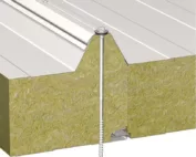
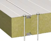
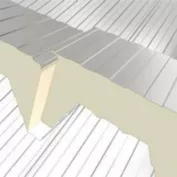
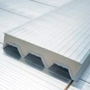
If the roof is already in place, use its colour as the starting point for the façade. Compare samples of the roofing, render and window frames outdoors at the same time. Tilt the roofing sample to match the pitch and see how the combination looks against nearby buildings. Check local planning requirements before settling on the palette. For a façade made from sandwich panels, consult the system documentation as well: the chosen colour can affect the permitted support spacing.
Which element should I start with when choosing colours?
If the covering already exists, it is easiest to match the remaining surfaces to it. The roof is harder to change than the colour of render. In a new house, it is worth determining the colour of the roof, windows and main façade elements at the same time. Choosing each material separately can produce a set of similar but clearly mismatched shades.
Before deciding, check the local requirements and the surroundings. A building viewed between neighbouring houses looks different from one in an isolated visualisation. The share of the roof in the view from the street also matters. With steep pitches, its colour is dominant, while with a low roof the façade may take on a stronger role.
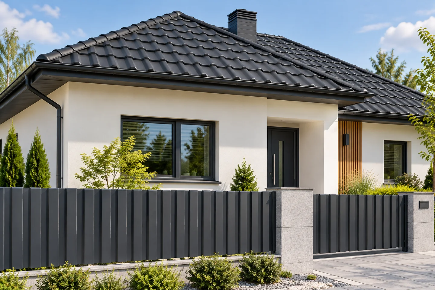
What goes well with a graphite roof?
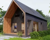
Graphite offers many possibilities because it works well with light surfaces and simple geometry. Warm white, delicate beige or light grey can provide a calm background. Wood or a wood-like material is worth using as a deliberate accent. It does not have to appear at every window, on the soffit and on the fence at the same time.
Be careful about mixing cool and warm greys. Two shades that look neutral on their own may reveal a blue or brown tone when placed together. Place the render sample next to the actual sheet metal and window frame. Assess them in the same light instead of comparing photographs from different websites.
How do I match the façade to brown and red?
With a brown roof, it is worth considering muted, warmer shades for the façade. However, the specific brown matters, as it may be cool, chocolate or more rusty. Not every beige will suit every version. A small difference in undertone can change the perception of the whole house.
Red and brick-coloured covering is a distinct element of the composition. A calm façade around it helps maintain balance. If brick, stone and wood are also present, it is worth limiting the number of different patterns. It is not about banning strong combinations, but about deliberately deciding which material should attract the eye.

Why do a sample and a screen show a different effect?
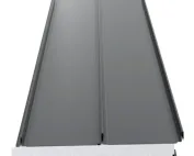
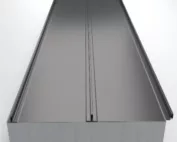
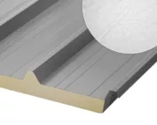
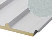
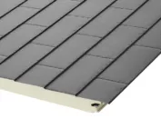
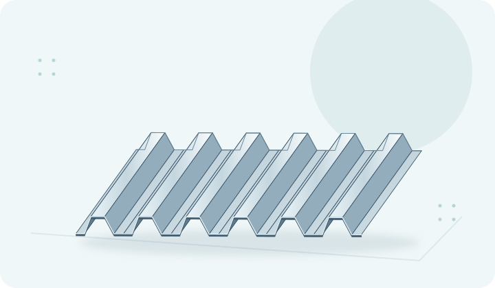
The monitor, camera and lighting affect the perception of colour. A small cut-out also looks different from a whole roof slope. The shaped surface of tile-effect roofing reflects light at different angles. The ribs of trapezoidal sheets cast bands of shadow whose width changes with the position of the sun. The same coating on a flat sample may appear calmer than on the finished profile.
Gloss and texture matter. Matt reduces harsh reflections, but its appearance also depends on the direction of light. It is worth viewing the sample in sun, shade and under a cloudy sky. It is best to place it at an angle close to that of the roof slope. Viewing only horizontal sheet metal on a desk does not reflect the conditions of the finished roof. When choosing render, a larger test patch on the wall is helpful. It allows you to assess the shade next to the shadow cast by the eaves and the actual joinery.
How do you combine gutters, soffits and fencing?
These elements do not have to be exactly the same colour, but they should follow one concept. Gutters matched to the roof usually stand out less. Downpipes close to the façade can be less visible on the wall. It is worth deciding consciously whether the drainage is to form the outline of the house or remain a quiet detail.
Metal fence pickets can be matched to the roof or the joinery. However, the sample should be compared, because different textures with the same colour code can look different. With a large number of elements, it is good to limit the palette to a few main tones. Order in the colours often gives a better effect than adding another decorative material.
Does colour also matter technically?
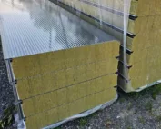
Darker surfaces usually heat up more strongly in the sun. In the case of long sheets and sandwich panels, thermal movement and system limitations must be taken into account. With sandwich panels, the colour influences the choice of length and support pattern. It is therefore not worth changing it at the last moment without checking the documentation.
Resistance to colour change also depends on the coating and environmental conditions. The colour code alone does not describe durability. Before purchase, check the finish parameters and the scope of the warranty. The final combination is best approved on actual samples. This way the choice is based on the material that will go on the house, and not solely on an attractive visualisation.
7 branches. Materials closer to your project.
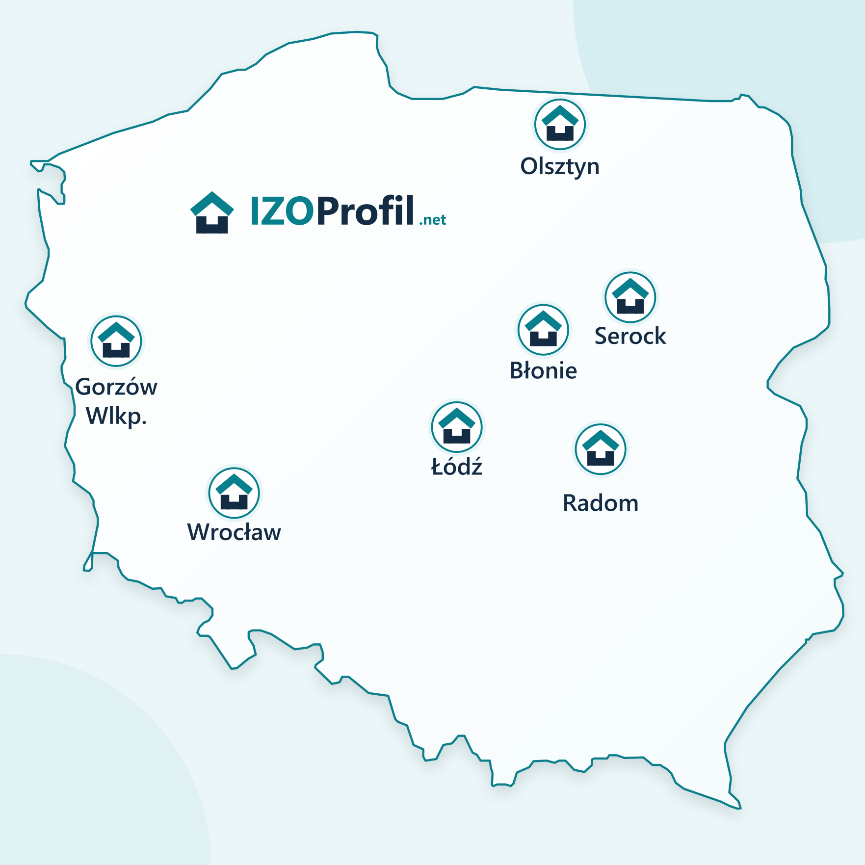
- SEROCK — Dzierżenin 34 E
- BŁONIE — ul. Sochaczewska 138A
- RADOM — ul. Grobickiego 8
- ŁÓDŹ — Natolin 8
- OLSZTYN — Barczewo, ul. Prosta 9
- WROCŁAW — ul. Jerzmanowska 10C
- GORZÓW WLKP. — ul. Zielona 33/34